ARE YOU BORED WITH YOUR EMAIL DESIGNS?WE GET IT.
Great news! A lot of fun and interactive design elements can be added to your emails. Email design is full of nuance, and when all the best practices for deliverability, renderability and accessibility are factored in, the end design can be lackluster. But when you are aware of what design options are supported by the majority of reading environments specific to your audience, great design options are available to you.
Check out the interactive design elements below. We advise using analytics of your email deployments to learn which design elements would be supported by the majority of your audience for future emails. Once we have the results, we can recommend specific interactive elements to liven up your emails and drive results.
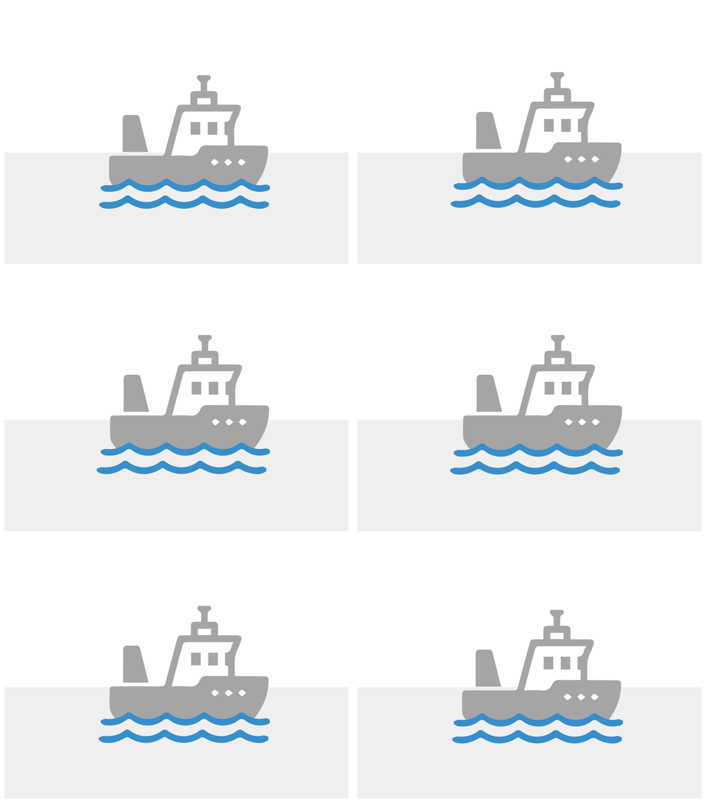
GIF IMAGE ANIMATION
| Pros: | Adds visual appeal and is proven to increase click-through and conversion rates. |
| Cons: | Most email reading environments will show the full animation, but Outlook and Lotus Notes will only show the first frame of it. |
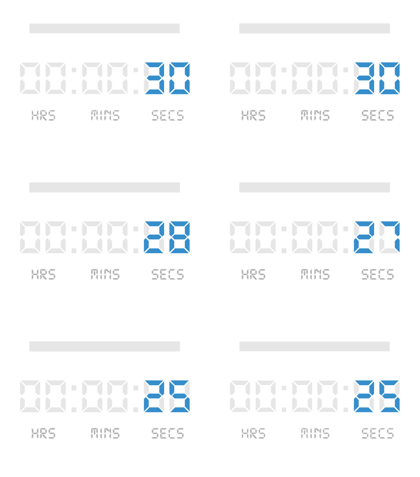
COUNTDOWN TIMER
| Pros: | Gives an email urgency to speed up conversion time. |
| Cons: | Most email reading environments will show the countdown clock animation, but Outlook and Lotus Notes will only show the first frame of it. |

GRAPHS
| Pros: | Showcases data/information in a highly visible way. |
| Cons: | Most email reading environments will show the full animation of the graph, but Outlook and Lotus Notes will only show a legible version of the graph without animation. |

INTEGRATED FORMS
| Pros: | Allows you to collect information in the email vs. driving your audience to a landing page to complete the form. |
| Cons: | Outlook, mobile and other desktop email clients may show the form but it will not function. |

COLLAPSIBLE CAROUSEL
| Pros: | Companies can showcase multiple categories and products with the most detail in a small amount of space. |
| Cons: | Outlook, Android mobile and other non-Mac desktop email clients will not see the carousel at all. |

